SVG (Scalable Vector Graphics) is a vector graphics markup language that allows you to create scalable and
interactive images for Web pages and other digital media.
SVG uses mathematical formulas to define points, lines, and curves, allowing you to create images that
which can be scaled without loss of quality. In addition, SVG images can be animated programmatically
modify and interact with them on the Web page.
SVG images are also small, which improves page loading speed, especially when used on mobile devices with slow internet connection.
To write SVG to HTML we need a tag:
<svg>
</svg>
Basic basic shapes
The main part of the images is created from several simple shapes such as a circle, rectangle, line, etc. In combination, these shapes allow you to create the most diverse images in terms of form and content.
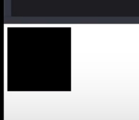
Square
rect – allows us to create a rectangle or square. For example, let’s create a square 150px by 150px:
<svg>
    <rect width="150" height="150"></rect>
</svg>
To round the corners of our rectangle, use the rx and ry properties as in normal CSS:
<svg>
    <rect width="150" height="150" rx="20" ry="100"></rect>
</svg>

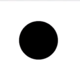
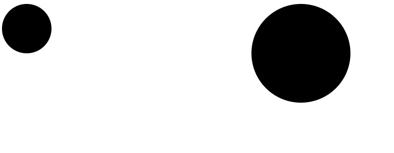
Circle
To create a circle, use the circle tag:
<svg>
<circle r="50" cx="50" cy="50" height="100" width="100"></circle>
</svg>
The r tag – allows you to set the radius of the shape, if the size of our shape is 100px, then the radius must be set to 50px in order to make a circle.
cx and cy – set the coordinates of the center of the circle
height and width – width and height of the element
Oval
<svg width="200" height="150">
    <ellipse rx="100" ry="70" cx="100" cy="70"></ellipse>
</svg>
rx – the radius along the x axis, we set half of the width of the svg
ry – radius along the y axis, put half of the SVG height
cx and cy – set the coordinates of the center of the circle

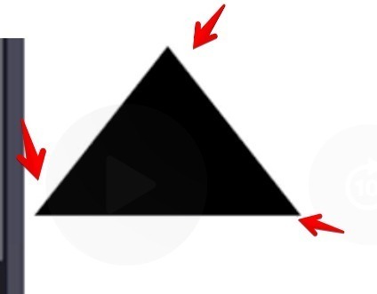
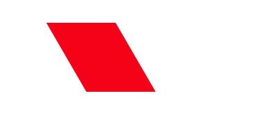
Polygons
To create polygons, use the polygon tag:
<svg width="200" height="150">
    <polygon points="0.150 100,0 200,150" width="200" height="150"></polygon>
</svg>
points – allows you to create points from which lines go to create our rectangle. 0.150 our first point will be located at 0px on the x-axis and 150px on the y-axis
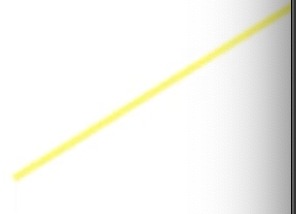
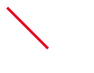
Line
To create a simple svg line use the line tag:
<svg width="200" height="150">
    <line x1="200" y1="0" x2="5" y2="150" stroke-width="5" stroke="yellow"></line>
</svg>
x1 – sets the coordinates along the x-axis of the first point
y1 – sets the y-axis coordinates of the first point of the point
x2 – sets the coordinates along the x-axis of the second point
y2 – sets the coordinates along the y axis of the second point
By default, the line has no color or thickness, let’s set them:
stroke-width=”5″ – stroke width 5px
stroke=”yellow” – line color
Curve
<svg width="200" height="150">
    <polyline points="0,110 30,45, 80,150 140,30 150,160 10,20 200,1" stroke-width="5" stroke="yellow" fill="none">
    </polyline>
</svg>
points – allows you to create points from which lines will go to create our line
0.110 our first point will be located at 0px on the x-axis and 140px on the y-axis
fill=”none” – will disable filling between points

This can be changed by setting through the CSS properties overflow: visible
Complex svg shapes
path and g are two important elements in SVG that are used to create complex vector shapes.
path – is an element that allows you to create complex paths and curves. With commands such as M (move to), L (line to), C (curve to), and Z (close path), you can specify points and curves that join together to create the desired shape. Path also allows you to create closed and open paths, as well as internal paths.
For example, let’s create a square using path:
<svg>
    <path d="M10 10 L50 10 L50 50 L10 50 Z" />
</svg>
g – is an element that is used to group objects in SVG. This allows you to manage multiple objects as a single entity.
For example, you can create a group of several objects and move them at the same time, change their scale, or apply a style to the entire group. g also allows you to create nested groups, which can be useful when creating complex shapes.
<svg>
    <g transform="translate(50, 50)">
        <rect x="0" y="0" width="50" height="50" fill="blue" />
        <circle cx="25" cy="25" r="20" fill="yellow" />
    </g>
</svg>
Filling and stroke
Fill and stroke (also known as outline) are the two main properties of SVG objects. The fill property is used to set the fill, and the stroke property is used to set the stroke.
<svg width="100" height="100">
    <circle cx="50" cy="50" r="40" fill="red" stroke="black" stroke-width="3" />
</svg>
cx and cy – set the coordinates of the center of the circle r sets the radius of the circle
fill=”red” – sets the fill color to red
stroke=”black” – sets the stroke color to black
stroke-width=”3″ – sets the stroke width to 3 pixels
fill=”none” – disables filling
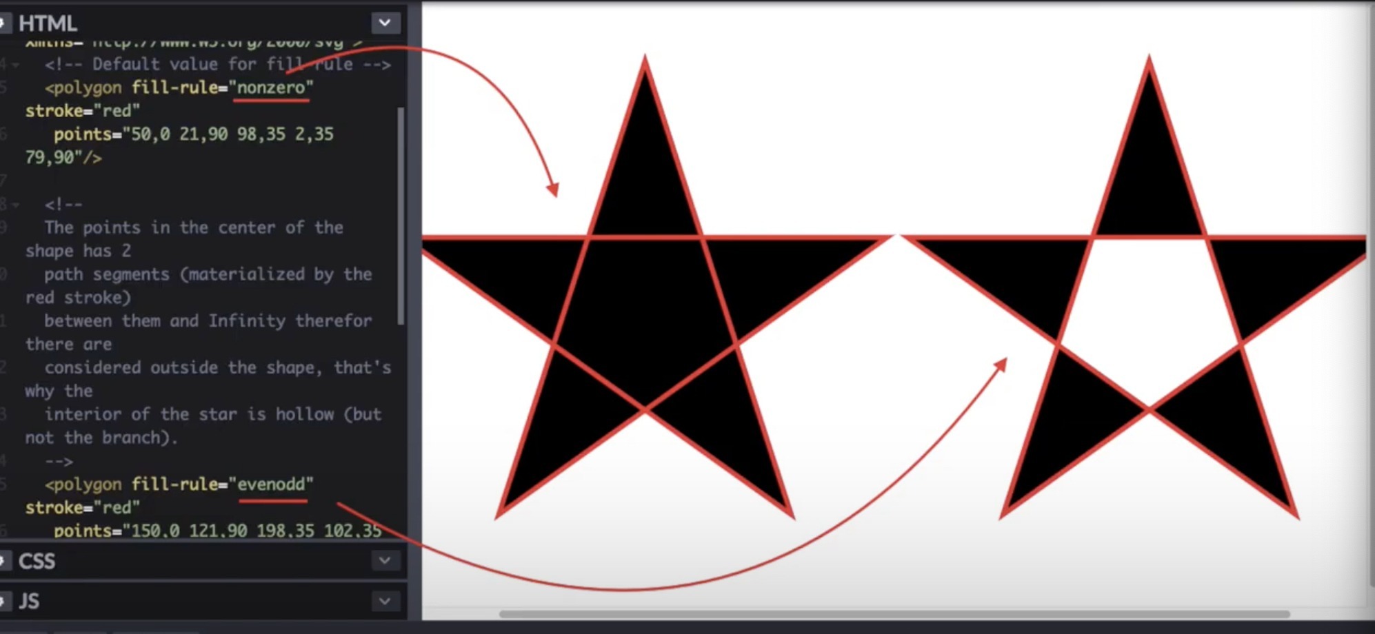
Fill-rule
fill-rule in SVG is used to determine how to fill a closed shape or path. This property can take two values: nonzero and evenodd
fill-rule=”nonzero” is the default value. It fills the shape by drawing a line from any point inside the shape to the outer edge of the shape and continuing in a straight line until it reaches another point inside the shape.
The direction of the line can be either clockwise or counterclockwise, and all points are inside the area to be filled.
fill-rule=”evenodd” – This value is used to fill shapes that have intersecting paths. It fills areas of the shape, starting at any point and switching between filled and unfilled each time an intersecting path is reached.
This creates the appearance that the contour is divided into two areas, one of which is filled and the other is not.
Fill-opacity
Let’s consider an example:
<svg viewBox="0 0 100 100">
    <rect x="10" y="10" width="80" height="80" fill="blue" fill-opacity="0.5" />
</svg>
In this example, we have an SVG element with viewBox 0 0 100 100 that sets the SVG viewable area to a 100×100 square. In SVG, we have a rect element with an x position of 10, a y position of 10, a width of 80, and a height of 80.
The fill property sets the color of the rectangle to blue, while the fill -opacity sets the opacity level of the fill to 0.5, making it semi-transparent.
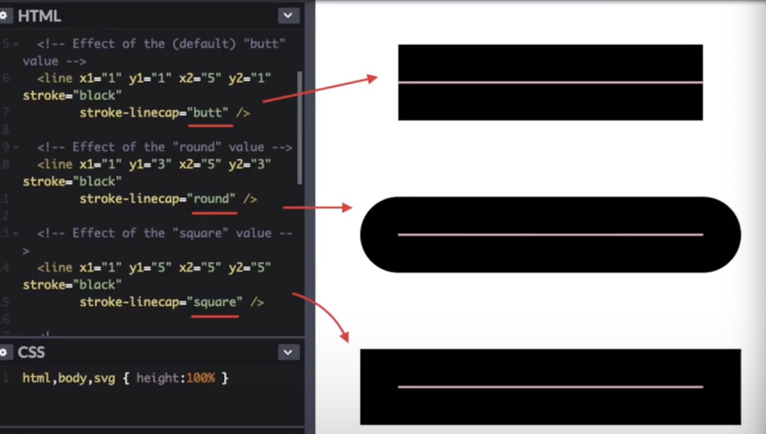
Stroke-linecap
stroke-linecap is an attribute in SVG that defines the shape of the end of a line or path.
There are three stroke-linecap values in SVG:
butt – the end of the line is simply cut off where it should end
round – the end of the line is rounded to a circle with a radius equal to half the line width
square – The end of the line is rounded to a square with a side equal to the line width
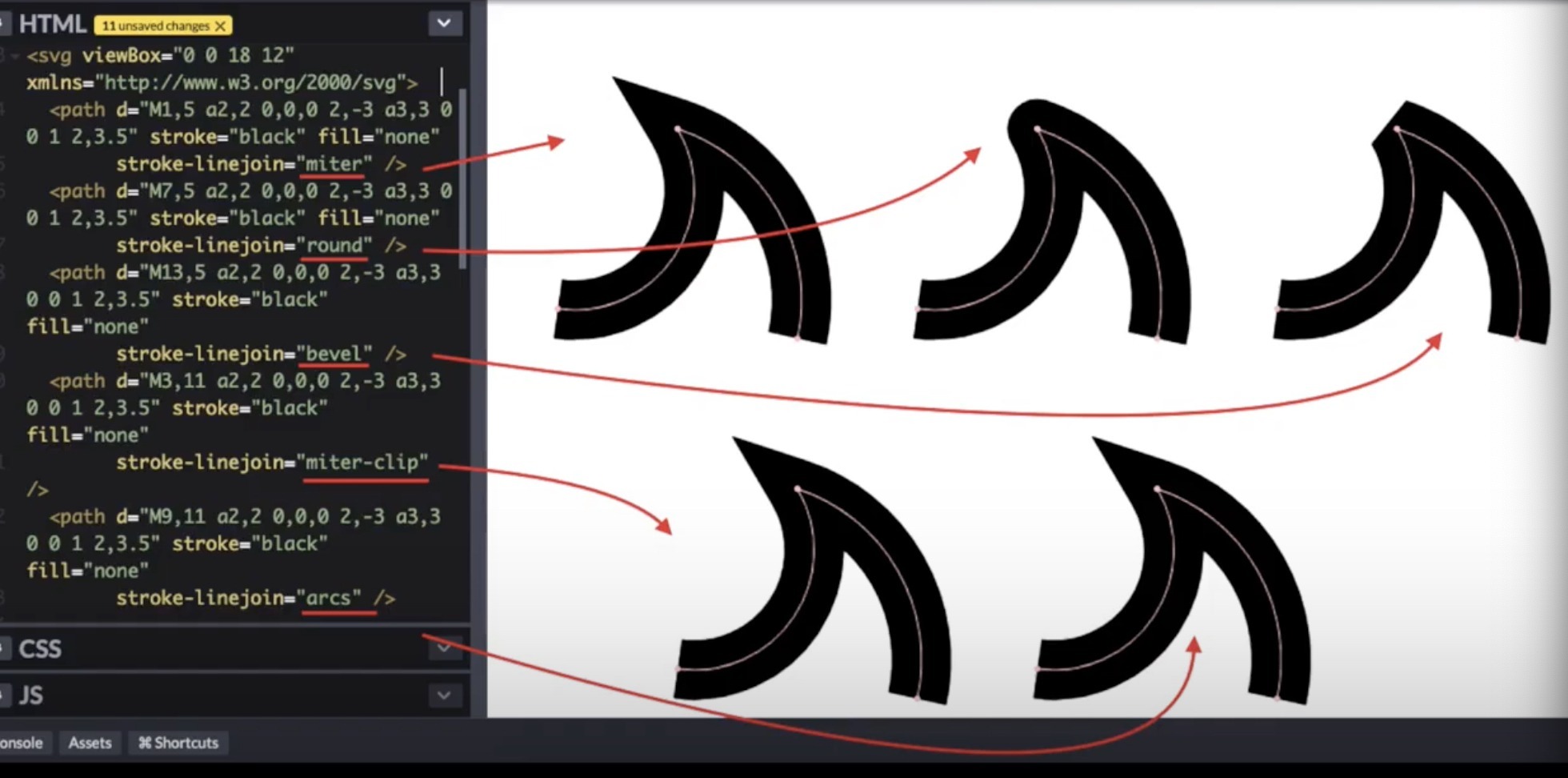
Stroke-linejoin
linejoin – controls how two lines that form an angle intersect when they are drawn as a stroke on an element.
The stroke-linejoin values can be:
miter (default) – line boundaries continue to the point of intersection, and then cut off
round – adds a round segment to the corners
bevel – adds a triangle-shaped segment to the corners
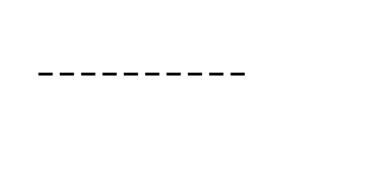
Stroke-dasharray
stroke-dasharray – in SVG, allows you to set a dashed style for the outlines (lines) of elements. It defines the lengths of the line segments and the spaces between them. The attribute value is specified in the format “line_length, gap_length”.
If multiple values are specified, they will be cycled through for line lengths and gaps.
For example, setting the stroke-dasharray attribute to “10.5” would result in a line consisting of 10px long spans and 5px long gaps.
Example:
<svg>
    <line x1="50" y1="50" x2="200" y2="50" stroke="black" stroke-width="2" stroke-dasharray="10,5,10,5" />
</svg>
Stroke-dashoffset
The stroke-dashoffset attribute in SVG controls the offset of a dashed or dashed line by setting the distance between the start of the path and the start of the line segment.
The stroke-dashoffset value can be given in pixels or as a percentage of the path length. A value of 0 corresponds to the beginning of the path, and a value equal to the length of the path corresponds to the end of the path.
<svg>
    <path d="M50 100 L150 100" stroke="black" stroke-width="2" stroke-dasharray="10 10" stroke-dashoffset="50%" />
</svg>
Can take values in percent, pixels, and 1
Stroke-opacity
stroke-opacity is an SVG attribute that sets the stroke opacity of an SVG shape. The stroke property is used to set the color of the stroke, while the stroke-opacity property is used to set the opacity of the stroke.
The stroke-opacity value can range from 0.0 (fully transparent) to 1.0 (fully opaque). By default, the stroke-opacity value is 1.0, which means that the stroke is completely opaque.
SVG gradients
SVG gradients are a way to create smooth transitions between two or more colors or shades in SVG vector images.
Gradients can be linear, radial, or conic, and can be created using the linearGradient, radialGradient, and conicGradient tags.
Each gradient can contain multiple colors, and each color can have its own transparency level.
Gradients can also be animated with CSS or JavaScript, allowing you to create dynamic and interactive effects on Web pages.
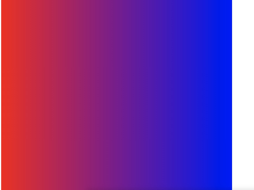
Linear gradient
SVG uses the linearGradient element to create a linearGradient:
<svg width="400" height="400">
    <defs>
        <linearGradient id="linearGradient" x1="0%" y1="0%" x2="100%" y2="0%">
            <stop offset="0%" stop-color="#ff0000" />
            <stop offset="100%" stop-color="#0000ff" />
        </linearGradient>
    </defs>
    <rect width="100%" height="100%" fill="url(#linearGradient)" />
</svg>
In this example, we are creating a gradient that goes from red (#ff0000) to blue (#0000ff) from left to right.
To do this, we use the x1, y1, x2, and y2 attributes to define the start and end points of the gradient.
The offset and stop-color attributes are used to define the color values of the gradient at specific points.
defs – is an SVG element that allows you to define reusable elements or styles that can be referenced throughout your SVG document. The “defs” element typically contains child elements such as “gradient”, “pattern”, “filter”, “marker”, and “symbol” that define visual elements or effects used in the SVG image.
We then fill the rectangle with the rect element and use the fill attribute to specify the gradient we just created with the url(#linearGradient) attribute.
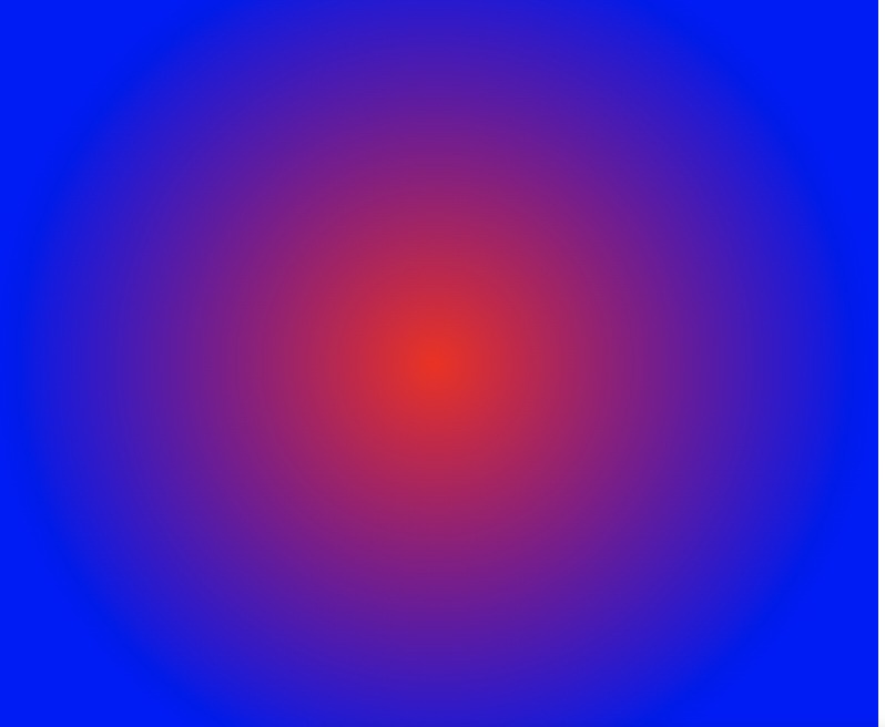
Radial gradient
A radial gradient is a gradient that changes from a center point to the edge of a circle or ellipse. SVG uses the radialGradient element to create a radial gradient.
<svg width="400" height="400">
    <defs>
        <radialGradient id="radialGradient" cx="50%" cy="50%" r="50%" fx="50%" fy="50%">
            <stop offset="0%" stop-color="#ff0000" />
            <stop offset="100%" stop-color="#0000ff" />
        </radialGradient>
    </defs>
    <rect width="100%" height="100%" fill="url(#radialGradient)" />
</svg>
In this example, we’re creating a gradient that goes from red (#ff0000) to blue (#0000ff) from the center point to the edge of the circle.
We use the cx, cy and r attributes to define the center and radius of the gradient circle. The fx and fy attributes specify the focal points of the gradient.
As in the first example, we use the offset and stop-color attributes to define the color values of the gradient at specific points.
We then fill the rectangle with the rect element and use the fill attribute to specify the gradient we just created with the url(#radialGradient) attribute.
So the rectangle will be filled with a radial gradient from red at the center to blue at the edge.
Gradient transparency
To set the transparency of our gradient, use the property stop-opacity=”1″:
<svg width="400" height="400">
    <defs>
        <linearGradient id="linearGradient" x1="0%" y1="0%" x2="100%" y2="0%">
            <stop offset="0%" stop-color="#ff0000" stop-opacity="1" />
            <stop offset="100%" stop-color="#0000ff" stop-opacity="0" />
        </linearGradient>
    </defs>
    <rect width="100%" height="100%" fill="url(#linearGradient)" />
</svg>

Svg size
The size of an SVG image can be specified in different ways:
Absolute size: This is when you explicitly specify the width and height of the SVG image in pixels (e.g., width=”500px” height=”300px“).
Relative size: This is when you specify the size of the SVG image as a percentage of its parent container (e.g., width=”50%” height=”50%”).
Viewport: This is when you define the size of the SVG viewport (the area where the image is displayed) using the “viewBox” attribute. The viewBox attribute takes four values separated by spaces: the x and y coordinates of the top-left corner of the viewport, followed by the width and height of the viewport (e.g., viewBox=”0 0 500 300″).
Viewport
This rectangle is defined using the width and height attributes, which set the width and height of the display area, and the x and y attributes, which set the coordinates of the top left corner of the display area in the SVG coordinate system.
The viewport in SVG is used to determine which SVG elements will be displayed on the screen. If the element is outside of the viewport, it will not be rendered.
This is especially important when working with SVGs, because SVG images can be very large, and the viewport allows you to determine how much of the image should be displayed on the screen.
viewport in SVG can be set in the element as well as through CSS properties:
<svg>
    <rect x="0" y="0" width="500" height="500"/>
</svg>

<svg class="svg">
    <rect x="0" y="0"/>
</svg>
In css:
.svg {
width: 500px;
height: 500px;
}
ViewBox
This attribute allows you to set the size and position of the view (visible area) for SVG elements.
The ViewBox is four space-separated numbers that indicate the (x, y) coordinates of the top-left corner and the width and height of the rectangle that bounds the viewport.
For example, if you have an SVG image that is 800×600 pixels and the ViewBox is set to “0 0 400 300” then that means the viewport starts at the top left and is 400×300 pixels. This allows you to zoom in and out of an image without losing quality and maintaining its aspect ratio.
The ViewBox also allows you to create responsive SVG images that can be viewed on different devices with different screen sizes, as they are automatically scaled to fit the screen size.
<svg viewBox="0 0 400 300">
    <rect x="0" y="0" width="800" height="600"/>
</svg>
If the width and height aspect ratio of our svg is 1:1, and other data is set through the viewbox, then the image is will acquire a 1:1 aspect ratio, we can set the parameter preserveAspectRatio=”none” will allow us to use the aspect ratio from the viewBox
Object transformation
One of its features is the transformation (transformation) of elements, which can resize, rotate, shift, distort, etc.
Translating (moving) an element:
<rect x="50" y="50" width="100" height="100" transform="translate(50, 50)" />
This example moves the rectangle 50 pixels to the right and 50 pixels down.
Element scaling:
<circle cx="50" cy="50" r="50" transform="scale(2)" />
This example doubles the radius of the circle.
Element rotation:
<rect x="50" y="50" width="100" height="100" transform="rotate(45)" />
This example rotates the rectangle 45 degrees clockwise.
Combining transformations:
<rect x="50" y="50" width="100" height="100" transform="translate(50, 50) rotate(45)" />
This example first moves the rectangle 50 pixels to the right and 50 pixels down, and then rotates it 45 degrees clockwise.
Element Distortion:
<rect x="50" y="50" width="100" height="100" transform="skewX(30)" />
This example skews the rectangle 30 degrees in the x-axis:
Element matrix transformation:
<rect x="50" y="50" width="100" height="100" transform="matrix(1, 0.5, -0.5, 1, 0, 0)" />
This example applies a matrix transformation to a rectangle. The matrix describes a combination of shift and scale.
Object transformation using CSS
You can set SVG transformations via CSS using the transform property. The advantage of using CSS is that you can easily apply styles to all elements that meet certain conditions without having to manually add a transform attribute to each element.
Below is an example of using CSS to apply transforms to a rectangle:
<style>
    rect {
        transform: translate(50px, 50px) rotate(45deg);
    }
</style>

<svg>
    <rect x="50" y="50" width="100" height="100" />
</svg>
In this example, we use the rect selector to apply transformations to the rectangle and define the transform property using the translate and rotate functions.
So we move the rectangle 50px to the right and 50px down, and then rotate it 45 degrees clockwise.
Path
In SVG, the “path” attribute is used to define the outlines of shapes. “Path” specifies a path, which may consist of commands such as “moveto” (move to a point), “lineto” (line to a point), “curveto” (Bezier curve), “closepath” (close path), etc. .d.
Each command has its own format and contains the coordinates used to draw the shape. Here are some examples:
Simple line:
<path d="M 10 10 L 90 90" />
Here “M” means the starting point (10,10) and “L” means the line ending at the point (90,90).
Bezier curve:
<path d="M 10 10 C 20 40, 40 60, 90 90" />
Here “C” means the Bezier curve defined by the points (20.40), (40.60) and (90.90).

Closed figure:
<path d="M 10 10 L 90 10 L 50 90 Z" />
Here “Z” means closing the figure to the starting point (10,10).
Arc:
<path d="M 50 50 A 40 40, 0, 0, 1, 90 90" />
Here “A” means an arc defined with a radius of 40, a start angle of 0, an end angle of 1, and end at (90.90).

Here are some more characters that can be used in “path” commands:
“H” – horizontal line
“V” – vertical line
“S” – smoothed bezier curve
“Q” – quadratic bezier curve
“T” – smoothed quadratic bezier curve
ClipPath
ClipPath is an SVG element that allows you to clip or hide a specific area of an image or object.
It defines the boundaries of the area to be cropped, and anything outside those boundaries becomes invisible.
ClipPath can be used with any other SVG element, including graphics, text, and even other ClipPaths.
It can be customized with coordinates and dimensions specified within the element, or a reference to another element that defines the shape of the crop.
ClipPath example:
<svg>
    <clipPath id="myClip">
        <rect x="0" y="0" width="50" height="50" />
    </clipPath>

    <rect x="10" y="10" width="100" height="100" clip-path="url(#myClip)" />
</svg>
In this example, we define a ClipPath element with the id “myClip” that contains a rectangle with coordinates (0,0) and dimensions 50×50.
We then use this ClipPath by applying it to another rectangle with coordinates (10,10) and dimensions 100×100.
As a result, only that section of the rectangle that is inside the ClipPath area will be displayed.
ClipPathUnits is an attribute that defines the units used to set the coordinates and dimensions of the ClipPath element. It can take one of two values:
userSpaceOnUse – this value specifies that the ClipPath’s coordinates and dimensions are in user coordinates, which can be different for each element using this ClipPath. If this attribute is not specified, the user coordinates are used by default.
objectBoundingBox – this value specifies that the ClipPath’s coordinates and dimensions are given in relative units, which correspond to the size and coordinates of the element using this ClipPath.
Thus, values can be from 0 to 1, where 0 is the origin and 1 is the end of the element in the given direction.
An example of using ClipPathUnits:
<svg viewBox="0 0 100 100">
    <clipPath id="myClip" clipPathUnits="objectBoundingBox">
        <rect x="0" y="0" width="0.5" height="0.5" />
    </clipPath>

    <rect x="10" y="10" width="80" height="80" clip-path="url(#myClip)" />
</svg>

In this example, we are defining a сlipPath that uses the “objectBoundingBox” units. We then define a rectangle inside the ClipPath that has dimensions of 0.5×0.5 in relative units.
We then use this ClipPath to clip another rectangle at coordinates (10,10) with dimensions 80×80 in user coordinates. Thus, only the top left 40×40 square (half the width and height of the rectangle) will be displayed.
SVG patterns
The “pattern” tag is used to create patterns that can be used to fill shapes and objects on an SVG image.
An example of using the “pattern” tag in SVG:
<svg width="200" height="200">
    <defs>
        <pattern id="checkerboard" x="0" y="0" width="20" height="20" patternUnits="userSpaceOnUse">
            <rect x="0" y="0" width="10" height="10" fill="#ffffff"></rect>
            <rect x="10" y="10" width="10" height="10" fill="#ffffff"></rect>
            <rect x="10" y="0" width="10" height="10" fill="#000000"></rect>
            <rect x="0" y="10" width="10" height="10" fill="#000000"></rect>
        </pattern>
    </defs>

    <rect x="0" y="0" width="200" height="200" fill="url(#checkerboard)"></rect>
</svg>
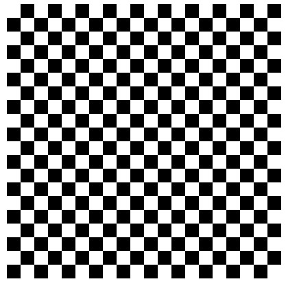
In this example, we are creating a template with the ID “checkerboard“, which is a checkerboard of black and white squares.
We then use this template to fill a rectangle on an SVG image using the “fill” attribute and the value “url(#checkerboard)“.
The “pattern” tag has several attributes that can be configured to define the dimensions of the pattern, its location, units of measurement, and so on. For example, the “x” and “y” attributes specify the coordinates of the top left corner of the pattern, and the “patternUnits” attribute specifies which units are used to determine the dimensions of the pattern.
Sure, here’s an example of using the “pattern” tag with an image inside:
<svg width="200" height="200">
    <defs>
        <pattern id="image-pattern" x="0" y="0" width="200" height="200" patternUnits="userSpaceOnUse">
            <image href="https://example.com/image.jpg" x="0" y="0" width="200" height="200" />
        </pattern>
    </defs>

    <rect x="0" y="0" width="200" height="200" fill="url(#image-pattern)"></rect>
</svg>
In this example, we are creating a template with the id “image-pattern” which is an image loaded from an external source using the “href” attribute inside the “image” tag.
We then use this pattern to fill a rectangle on an SVG image using the “fill” attribute and the value “url(#image-pattern)“.
Insert text in SVG
Inserting text into an SVG image is done using the
 <svg viewBox="0 0 200 50">
        <rect x="0" y="0" width="200" height="50" fill="#eee" />
        <text x="50%" y="50%" dominant-baseline="middle" text-anchor="middle" fill="#333">Example text in SVG</text>
</svg>
This example creates a rectangle rect, then adds text text to center the rectangle.
The x and y attributes define the coordinates of the start of the text, dominant-baseline defines the baseline of the text, and text-anchor is the anchor point around which the text is aligned. The fill attribute specifies the color of the text.
In this case, the x and y values are 50%, which means the text is centered in the image.
The dominant-baseline is set to middle, which centers the text on the image’s vertical axis, and text-anchor is set to middle, which centers the text on the image’s horizontal axis.
TextPath
The textPath element in SVG is used to display text along a path. With this element, you can create curved text effects, text following a curve, and other interesting effects.
The textPath element is embedded inside the text element and is bound to the path defined in the path element.
Here is an example using the textPath element:
 <svg viewBox="0 0 200 200">
                <path id="myPath" d="M 50,150 A 100,100 0 0 1 150,150" fill="none" stroke="#333" />
                <text>
                    <textPath xlink:href="#myPath" fill="#333">Text on a curve</textPath>
                </text>
</svg>
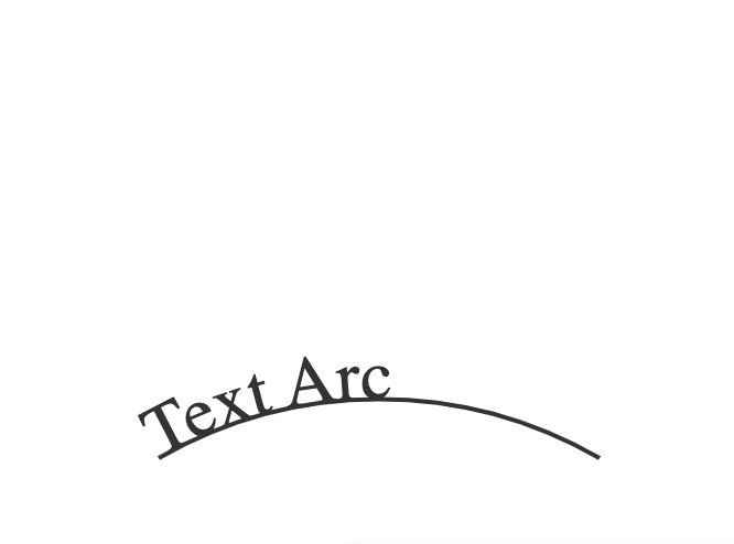
This example creates a “path” that defines a curved line and a text element with a “textPath” element that references that path using the “xlink:href” attribute.
The “fill” attribute specifies the color of the text, and on the path element, the color is specified using the stroke attribute.
The text will be displayed along the path defined in the path element. The result will look like curved text following the path line.
SVG sprite
An SVG sprite is an SVG file that contains many small images or icons within a single file.
It can be used to reduce server requests and speed up site loading, since all images are stored in one file and the browser can only download it once.
Here is a simple example of an SVG sprite containing several icons:
<svg xmlns="http://www.w3.org/2000/svg" style="display: none;">
    <symbol id="icon-cart" viewBox="0 0 24 24">
        <path d="M9 21C7.9 21 7 20.1 7 19H3V17H18V19H14.5C14.2 19.7 13.6 20.3 12.9 20.5L13.4 22H17V24H5V22H8.5L9 21ZM6 8H8.82L10.34 16H19V18H10.87L9.87 12H6V8ZM16 10C17.1 10 18 9.1 18 8C18 6.9 17.1 6 16 6C14.9 6 14 6.9 14 8C14 9.1 14.9 10 16 10Z" />
    </symbol>
    <symbol id="icon-heart" viewBox="0 0 24 24">
        <path d="M17.66 3.58C15.94 2.1 13.72 2.1 12 3.58C10.28 2.1 8.06 2.1 6.34 3.58C3.12 6.04 3.12 10.48 6.34 13.38L11.99 18.92L17.66 13.38C20.88 10.48 20.88 6.04 17.66 3.58Z" />
    </symbol>
</svg>
In this example, we’ve created an SVG sprite containing two icons: “icon-cart” and “icon-heart“.
Each icon is defined inside a symbol tag, which gives a unique identifier for each icon, as well as their sizes and coordinates.
To use an icon from an SVG sprite, we can use the “use” tag and specify the icon ID.
For example, to add an “icon-cart” icon to a web page, we can use the following code:
<svg class="icon">
        <use xlink:href="#icon-cart"></use>
</svg>
Here we have created a new svg element, given it a class of “icon“, and added a “use” tag with an xlink:href attribute that refers to the id of the icon in the SVG sprite.
SVG Animation
SVG animations can be created with CSS or JavaScript. In CSS, animations are defined using keyframe animations that define the start and end states of an element.
Some examples of SVG animations can include rotation, translation, resizing, shading, scaling, etc. Animations can be synchronized with web page events such as mouse click, hover, page scroll, etc.
All in all, SVG animation can create beautiful and interactive elements on your web page and help improve user experience.
Here is an SVG animation example:
<head>
    <title>Example SVG animation</title>
    <style>
        #circle {
            fill: blue;
            transition: fill 2s;
        }

        #circle:hover {
            fill: red;
        }

        .animate {
            animation: pulse 1s infinite;
        }

        @keyframes pulse {
            0% {
                transform: scale(1);
            }

            50% {
                transform: scale(1.5);
            }

            100% {
                transform: scale(1);
            }
        }
    </style>
</head>

<body>
    <svg width="100" height="100">
        <circle id="circle" cx="50" cy="50" r="25" />
        <rect x="10" y="10" width="30" height="30" class="animate" />
    </svg>
</body>

</html>
.animate – is the selector for the square. We use keyframe animation to create a pulsating effect. The animation property specifies the name of the animation (pulse), duration (1s), and number of repetitions (infinite).
@keyframes pulse is a CSS rule for defining keyframe animations. We set three states:
- 0% (initial state)
- 50% (middle of animation)
- 100% (final state)
In each state, we set a value for the transform property, which scales the element up or down.
SVG optimization
SVG optimization can help speed up page loading, reduce traffic usage, and improve website performance. Below are some ways to optimize SVG for web pages:
- Reduce the number of paths – if the image consists of many paths, you can merge them into one. This can greatly reduce the size of the SVG file.
- Remove unnecessary elements – if there are elements in the image that are not used, they should be removed. For example, if there is unnecessary text in the logo, it can be removed.
- Use optimal export settings – when exporting SVG from a graphics editor, you need to set export settings to get the best result. For example, you can choose to shrink, reduce number of colors or reduce the file size.
- Use viewBox attribute – The viewBox attribute defines the area to be displayed. If SVG does not contain this attribute, the browser will render the entire area, which can lead to unnecessary resource usage.
- Use CSS for Styling – Instead of directly styling SVGs, you can use CSS to reduce code and file size.
- Reduce the number of points – you can reduce the number of points in paths using the path optimization option in the graphics editor.
- Use optimization tools – there are tools that automatically optimize SVG files, such as SVGO or SVGOMG.
- Compress file – You can compress the SVG file using special programs such as Gzip.