These CSS features expand our ability to create dynamic layouts and design components that are more flexible than before. They can be used to adjust container element sizes, fonts, padding, and more.
min
The min() function takes one or more comma-separated values and returns the smallest of them. This function is used to limit CSS property values to a hard-coded maximum level.
Consider the following example. We want the element’s maximum width to be less than 500px:
.element {
    width: min(50%, 500px);
}
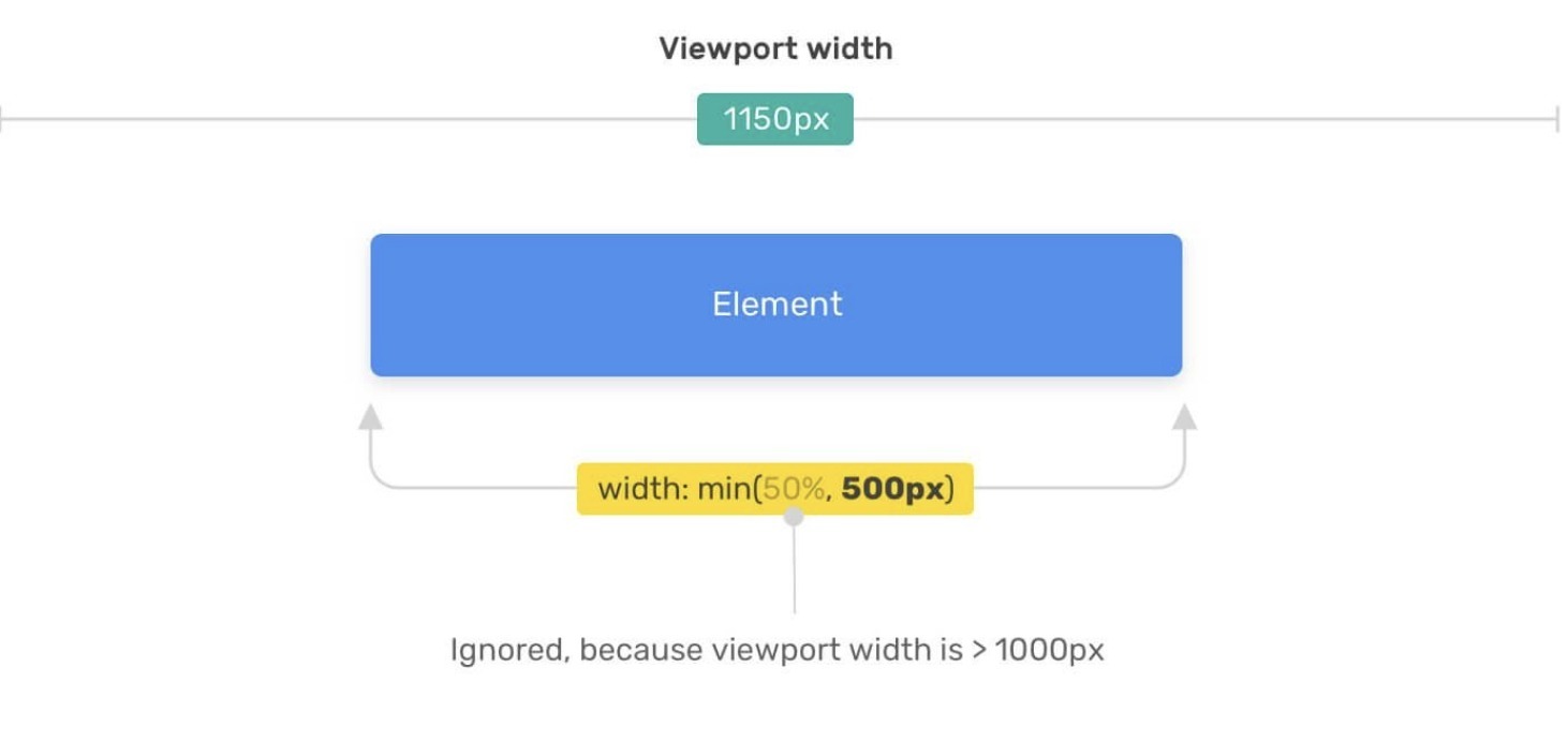
With a viewport width of 1150px, which is greater than 1000px, the element will be 500px wide.
The browser will need to choose the smallest value between 50% and 500px. The selection result is affected by the width of the viewport. If 50% of the viewport width is more than 500px, then this value will be ignored and the function will return 500px.
max
The max() function takes one or more comma-separated values and returns the largest of them. This function is used to fix the minimum value that a CSS property can take.
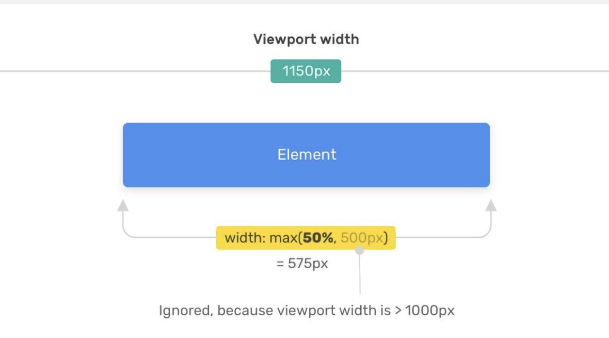
In the following example, we want the element to be at least 500px wide.
.element {
    width: max(50%, 500px);
}
The browser needs to choose the maximum value from 50% and 500px. The choice depends on the width of the viewport.
If 50% of the viewport width is less than 500px, the browser will ignore this value and use the 500px value.
clamp()
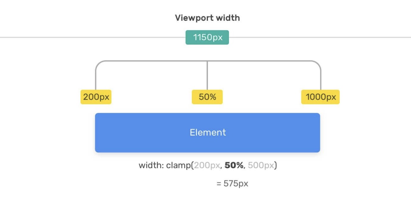
The clamp() function allows you to limit the range of a certain value by setting its lower and upper limits.
It takes three parameters: a minimum value, a calculated (recommended) value, and a maximum value. If the calculated value does not go beyond the limits of the minimum and maximum values passed to the function, then it will return exactly that value.
.element {
    width: clamp(200px, 50%, 1000px);
}
Here we set the width of the element, which should not be less than 200px and not more than 1000px. If the value of 50% does not go beyond these limits, this value is used. Here’s what it looks like.
When specifying a calculated value, you can use different units of measurement: %, em, rem, vw/vh. Even if the value is expressed as a percentage, it can be calculated using either the width of the viewport, if the element is in the <body> tag, or the width of another element that is the element’s container.
It is worth saying that when using the clamp() function, you can pass mathematical expressions to it, which saves us from the need to use the calc() function.
.type {
  /* /* Limit font-size to values between 12px and 100px */*/
  font-size: clamp(12px, 10 * (1vw + 1vh) / 2, 100px);
}
Examples
.wrapper {
    display: flex;
}

aside {
  flex-basis: max(30vw, 150px);
}

main {
  flex-grow: 1;
}
The minimum width of the aside element will be 150px. It will take a size of 30vw if the viewport width is greater than 500px (500 * 30% = 150).
An excellent use case for the clamp() function is the flexible font size of headings. Let’s imagine that we want the minimum font size for the title to be 16px and the maximum font size to be 50px.
By using the clamp() function, we can make sure that the font size stays within these values without going up or down.
.title {
    font-size: clamp(16px, (1rem + 5vw), 50px);
}

h1, h2, h3, h4, h5 {
    margin: min(7vh, 2.75rem) 0 1.05rem;
}
Through the use of the min() function, we set the maximum indent value to 2.75rem. As you can see, it is very simple and convenient.
Suppose we want a container element whose width should be 80% of the width of its parent element. In this case, the width of the container should not exceed 780px. How to create such a container? Usually in such a situation they do something like this:
.container {
    max-width: 780px;
    width: 80%;
}
But this can be written shorter and more conveniently using min:
.container {
    max-width: min(80%, 780px);
}
I like the clamp() function because it’s perfect for limiting the margins of page sections. Take a look at the following example, which shows customization of the top of the page (hero section).
.hero {
    padding: clamp(2rem, 10vmax, 10rem) 1rem;
}