Grid CSS is a CSS module that allows you to create grids for placing elements on a website or application page. It allows you to easily and quickly place elements according to the needs of the design, in particular, it provides the ability to create columns and rows with specified sizes and proportions. Grid CSS can be used as a replacement or in addition to traditional methods of placing elements using CSS, such as floating blocks and flex containers. Due to its flexibility and capabilities, Grid CSS is becoming an increasingly popular tool among web developers.
Grid lines are a grid consisting of horizontal and vertical lines that determine the placement of elements on a website page. There are two types of lines in Grid CSS:
- Row lines – horizontal lines that determine the placement of elements vertically. Each line-string has its own number, starting with 1.
- Column lines (column lines) – vertical lines that determine the placement of elements horizontally. Each line-column also has its own number, starting with 1.
Examples
First, let’s set the display grid:
display: grid;
We set the number of columns. 20% is the width of one column. If desired, we can make more or fewer speakers.
For example: 5 columns at 20%;
grid-template-columns: 20% 20% 20% 20% 20%;
If desired, we can make more or fewer lines. For example: 10 lines at 10%;
Next set the number of rows. 20% is the width of one row.
grid-template-rows: 20% 20% 20% 20% 20%;
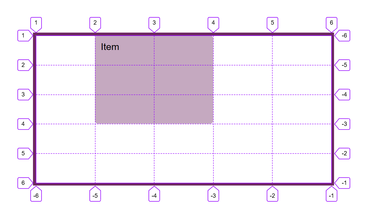
let’s set the beginning of our element with 3 vertical lines
grid-column-start:3;
When we use only grid-column-start, the grid-element will by default “grab” only one column. However, you can expand the element between several columns if you add the grid-column-end property.
And finish our element on number 6 vertical line:
grid-column-end: 6;
When we connected grid-column-start and grid-column-end, you might think that the end value must be greater than the start value. But it’s not!
We can set both positive and negative values for grid-column-start and grid-column-end:-2.
For example, we can set grid-column-start to -1 to indicate the first grid row starting from the right.
(Example block 5)
Instead of defining a grid item based on the starting and ending positions of the grid rows, you can define them with the width of the rows you need using span.
grid-column-start: 2;//Specifies the initial vertical line from which the element will begin
grid-column-end: span 3;//Specifies the number of columns that the element will occupy
(Example block 6)
We can also use span along with grid-column-start
(Example block 7)
In order not to write grid-column-start and grid-column-end every time, you can use grid-column which accepts these two parameters:
grid-column: span 2 / 6;
is the same as:
grid-column-start: span 2;
grid-column-end: 6;
Before that, we worked with our speakers and performed horizontal positioning. Grid allows us to position our elements vertically as well. There are properties for this:
grid-row-start:
grid-row-end:
The difference is that with grid-column we set the initial vertical and final vertical line of the grid that will be occupied by the element, and with grid-row the initial and final horizontal line.
(Example block 9)
Writing grid-row-start and grid-row-end as in column can be shortened using the property:
grid-row:2/5;
Now we know how to position our block both vertically and horizontally. Let’s try to use these properties at the same time:
grid-row: 3/5;
grid-column: 3/6;
(Example block 10)
To shorten the grid-row: 3/5 grid-column: 3/6 they can be combined into one property grid-area
This property takes 4 values separated by a slash /: grid-row-start, grid-column-start, grid-row-end, and grid-column-end.
grid-area: 2/2/6/-1;
(Example block 11)
In our grid, we can overlay several elements on top of each other:
block12
grid-area: 2/2/6/4;
block13
grid-area: 2/3/6/5;
(Example block 12 and 13)
If grid items don’t have a specific layout with grid-area, grid-column, grid-row, etc., they are automatically placed following the order written in the code.
We can change this with the order property:
order:3;
order: 2;
(Example block 14)
For block14 we set order:3 and it moved forward block13 which has order: 3, although in the code it is closer to the top and should be displayed first.
Up to this point, the garden has had a grid with five columns of 20% width and five rows of 20% height each.
We used to fill the entire width of the parent element, but we may not do that.
For example, let’s fill half the width of the parent element:
grid-template-columns:50%;
grid-template-rows: 20% 20% 20% 20% 20%;
(Example block 15)
Defining multiple columns with the same width can be tedious. Luckily, there is a repeat function to help with this.
For example, we used to define five columns of 20% width using grid-template-columns: 20% 20% 20% 20% 20%; This can be simplified to grid-template-columns: repeat(5, 20%).
columns:repeat(5, 20%);
grid-template-rows: 20% 20% 20% 20% 20%;
(Example block 16)
grid-template-columns accepts values not only in percentages, but also in units of length, such as px or em. You can even combine different units of measure.
Grid has another unit of measurement: fr.
Each fr allocates one piece of free space. For example, if two elements are given 1fr and 3fr respectively, then the space will be divided into 4 equal parts. The first element will take ¼, and the second the remaining ¾ of the space.
grid-template-columns:1fr 5fr 2fr;
(Example block 17)
We may not write every time and combine them into one property – grid-template:
For example, grid-template: grid-template: 100px 1fr 100px / 100px 400px; will create a grid with 3 rows one 100px, another 1fr, third 100px and 2 columns 100px and 400px.
(Example block 18)